Showing posts with label Drafting. Show all posts
Showing posts with label Drafting. Show all posts
Wednesday, 27 February 2013
Music Video - Second Draft
Music Video Final FIXED AUDIO from Haydon Media on Vimeo.
After recieving feedback from my first draft of my music video, the only thing my target audience could find that might be able to change is the lighting of my music video. This is because I was attempting to portray a different era, possibly the fifties.
In order to portray this I began to think about ways to portray lighting. This could be done with simple tweaks in contrasting on editing programmes, however I chose to go down the route of adding a filter light from After Effects to something more sepia like. Once going through a range of different filter lights, I began to experiment with them, everntually choosing one that I felt nicely portrayed the era I wished to represent. However, I then rendered my video and watching it back realised that the lighting effect I had added actually lowered the quality of the shots within my video. Shot's of the sun that are essential in portraying ther Indie Folk genre became too bright and blurry. Therefore, I decided I would have to remove this effect in order to portray my video in a professional manner.
Above is the Sepia filtered music video I experimented with.

Tuesday, 5 February 2013
Music Video - Anamatic
This is an Anamatic i created in order to give me an idea of what order I would like the images of my music video to be in. Firstly, I took my story board and cut it on Paint, cutting out all the images I drew. I then turned them all into JPGS and uploaded them to Adobe Premier Pro. After this I began to edit my pictures to the song I will be using in my music video - Birdy People Help People. I put them in the order I will be editing my final video in - her journey through the woods then her at the house. This has helped me as it has given me a visual aid that I will use when creating my final product.
Monday, 21 January 2013
Music Video Draft One
This is the first draft of my music video. When filming it I ensured to gather as many shots as I could. I experimented with angles and contrasts. As you can see it begins with different shots of the location, as i wanted to make sure that it was clearly and Indie Folk music video, as it contains elements that will be recignised by my target audience. For example, the location of the forest, shots of nature, gleaming sunlight etc...
I have decided to create a narrative based music video as when reading through my questionairre results I found that most of my target audience enjoy getting into a story, rather than watching the singer/s perform, which is different in comparison to music such as Rock, where the target audience would enjoy watching performance based music videos as they enjoy gigs. The narrative follows a young girl, as my target audience is a younger audience.
This is only my first draft as now I intend to edit my music video as much as possible, in order to make the lighting and pace perfect. I will be using After Effects in order to add a suitable filter light. As my audience feed back suggested that I should focus on the lighting of my video, as the shots and order of narrative are near enough perfect.
Tuesday, 27 November 2012
Magazine Advert - Third Draft

This is my third draft of my music magazine. As you can see, I have kept the layout of the two colours, in the different rectangles, however I have changed the bottom half to be more like a scattered collage. I put a photo of the front cover of the CD/Digipak, telling audiences the different ways it is available.
I used different photos from the set location, in order to make it look like a collection of memories. I kept the colours used from nature, so that it looks very naturalistic and earthy.
I also used my own 50's radio, so that I could create a more vintage look to the magazine.
I made the reviews come down in a diagonal direction, in order to appear scattered also.
Monday, 26 November 2012
Magazine Advert - Second Draft

This is the second draft of my musicians magazine advert. As you can see i have changed the layout completely after reading over the feedback I was given. In order to make it look more realistic, I looked through "Q" magazine at some of the music magazine adverts shown within it. I found many that I felt would be appropriate, however, eventually settled on using "Generation Terrorists" magazine advert as a stimulus for my design. I decided to have all the information on the top half and a picture on the bottom, however I now feel that I might change the bottom half to a number of scattered photos. I created an effect on the photo, after looking at Ellie Goulding's advertisement, the twinkle and lights effects made the artist look innocent and dreamlike, which is essential for my music artist. I have kept the reviews on there, as I feel this is important for marketing the album.
Thursday, 22 November 2012
Magazine Advert - First Draft

This is the first draft of my music magazine advert. I decided to use green and cream as the colour themes, this is because both of these colour s are evident in the image I have used, they are shown in the background of the green forest and are also evident in my main artists clothing. I decided to use RiotSquad font, this is because it is the font I have used on my front cover of the Digipak. This creates a house style and a theme for my artists name, almost giving it a distinct logo.
Another thing that i have clearly placed in line of the audiences eye is the album name "My Dream World..." The same name I have used in my music digipak. The Release Date is very large and in capital letters. This is so that audiences can clearly see when they can buy this album, allowing it to be printed in their mind - unforgettable.
I have used the same image of the birds as were used in the digipak, contributing to my concept of creating a logo for the name "Birdy".
The picture is right in the middle of the page, allowing audiences to instantly see whom the artist is, the vibrant colour editing i have applied to the photo make it more vibrant against the earthy dark green background.
The star ratings across the middle will contribute towards persuading my audiences to buy this product. As they all show 5 star ratings from top newspapers known in the UK: "The Times", "TheGuardian", "The Daily Mail". They also make comments on the actual video that will perhaps be persuasive in themselves.
Tuesday, 20 November 2012
Digipak - second draft



This is the second draft of my digipak. Here you are able to see the vast changes i have made from the first attempt i made at this product.
FRONT COVER:
I changed the photo to one i took on set location, as i felt it accompanied the concept of a 'dream world' - as this is my albums name. I changed the contrast of the photo, in order to make the colours more vibrant and the actual location seem more surreal and beautiful. The lighting on the sky looks as though it is a rainbow. The titles are italic and bold, but feminine, highlighting my theme of nature and beauty - which is typical within Indie Folk music bands. The animation of the birds adds the the photo, making it look more professional.
BACK COVER:
I changed the way my text was positioned, making it at the bottom on the grass, on the same page that used to be my "Thank You" page. I decided to get rid of this page as it made the digipak look less realistic and more childlike. I changed the colouring of the text too in order to accompany the colours from the front cover. I gathered these by using colours from my main artists dress, so that all colours look professional and well suited to the theme of my digipak.You can also see that I have changed my production logo, making it white, and having the word "records" written in circles. This makes it fit well with the other light colour production details at the bottom of the screen and also looks like records.
DISC HOLDERS:
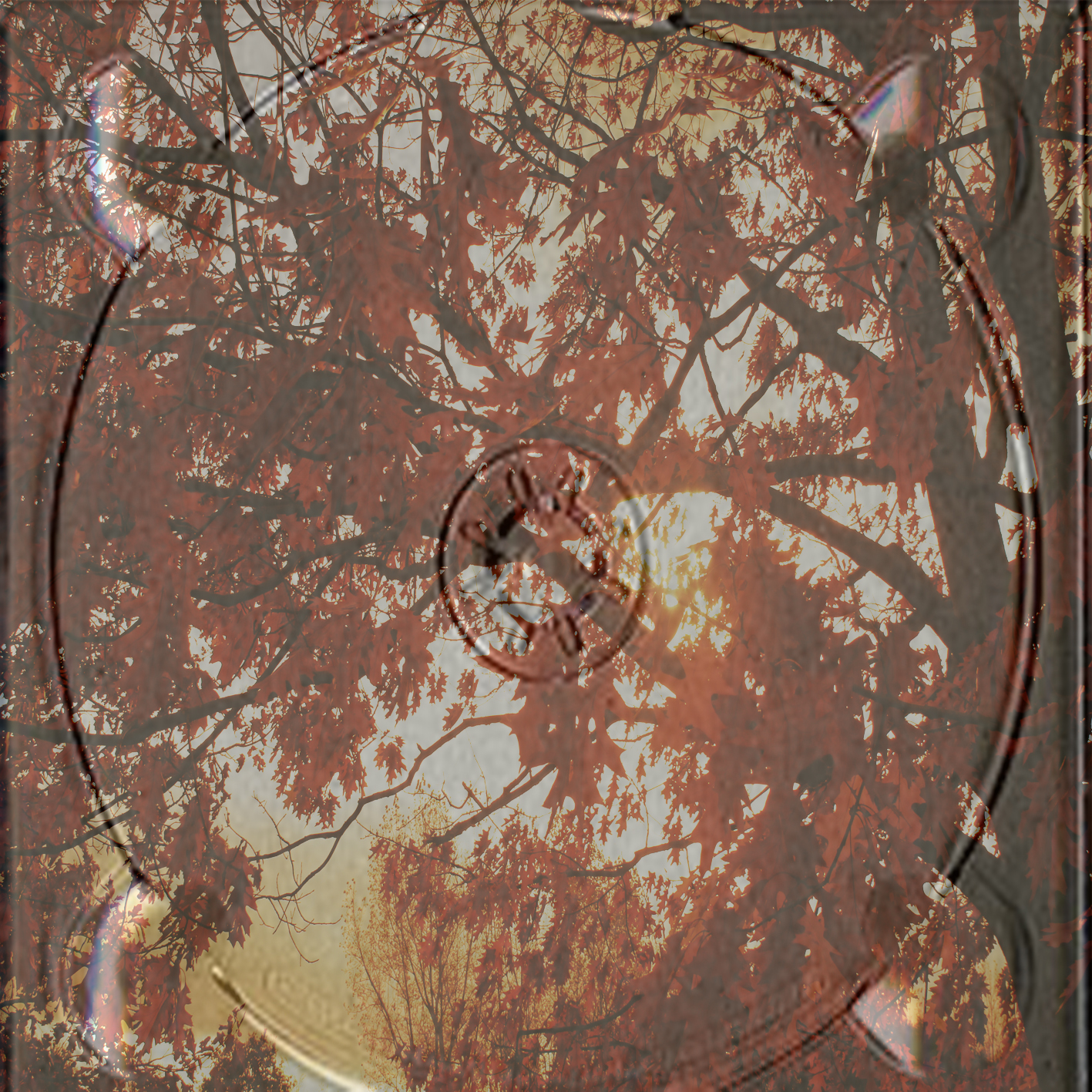
For these i decided i didn't want to break the theme of nature, and also didn't want a plain disc place, as it would look boring and unprofessional. Therefore I decided I would use photo's I took when filming, of trees, the orange leaves glow through very nicely, as well as fitting in with my vintage theme.
OTHER PHOTOS:
The two other pictures are of my music artist. This is because they look very much in theme with the rest of my disc and are also high quality photo's i took myself. These were taken on set location. The background and colouring of both photos fit very well with the rest of my digipak. They also show the music artist, which buyers of the product would like, as they will be fans of Birdy, therefore will want to have photos and momentum's of her.
Digipak - First Draft


Here is the first draft of my Digipak. After looking at my rough drafts on paper i decided that some of my ideas worked, whereas others did not work as well.
FRONT COVER:
As you can see my front cover is very minimalistic, I am yet to add my finished titling on the front cover, which will say : "Birdy, My DREAM WORLD..." This is because i am creating a very dream like, visually colourful and pretty digipak, therefore want to support that with the name of the album. I have used contrasting and editing of Hue and Saturation on Adobe Photoshop in order to make my image more golden and bright. I have then used a template of a golden picture frame around the picture in order to make it more vintage. I chose to have one photo in the actual picture frame, rather than scattered photos like a collage.. which is what my original idea was. This is because when i was experimenting with the collage on Photoshop, it did not look professional.
BACK COVER:
This cover is a picture I took on location, it is similar to my drawn draft as it is writing accompanied by the photo of outdoors. The writing is light white, in order to stand out against the photo. I have used the title of the album in bold at the top of the page in order to make it clear to the audience this is what the album is called. The writing is straight down the in a vertical line, as i wanted it be clear that it is the track list. At the bottom of the page is a bar code, in order to make it realistic. I have also included a record label logo, called Manza Records, so that it looks as though it is real. And also, production details at the bottom, trademarking the product - something that is seen on all digipaks.
THANK YOU PAGE:
Lastly I created a thank you page, and used a picture i also took on location. I edited the contrast of the photo, in order to make it more bright again, so that it looks as though it is within this album and fits with the house style. Within the thank you notes I have written nice messages to family members, friends and producers, as i feel this is something a young artist would do, as they would have received a lot of support from other people to achieve what they have. I gave the black text a drop shadow and an outer glow in order to make it readable against the green grass.
Wednesday, 24 October 2012
Magazine Advert - Pencil Draft

This was a paper draft of my magazine front cover that I created. I did this as i feel it is important to get a general idea of what you aim to create before creating it in order for it to look professional. After drawing this, i decided i might actually prefer to have the artists name above the photo and then underneath the name of the album "People Help the People" and the release date "30th June". This is a very simplistic design that will obviously be tweaked when i actually create it using Adobe Photoshop, however, i feel that this covers all the typical conventions as well as keeping in house style with my plan for my digipak. And also providing all the essential information needed to advertise Birdy. I even decided to have ratings from all the newspapers, as i feel this will be an important element for people looking to buy the album or song, purely because they will trust others viewpoints. I decided that i would quite like to have the artist playing some sort of intrument, and the picture will be in a sepia tone, in order to keep in form with my music video visual style. I feel the use of an instrument, like the acustic or piano, will reflect the actual tone and atmosphere of the artist.
Thursday, 18 October 2012
MUSIC VIDEO - STORY BOARDS


I decided it was essential to create a story board before shooting my music video. This is because it will set a guideline of what shots i should be aiming to get when filming my music video.It will ensure i do not forget anything important, and will also help me to remember the order of my story line. Some of the shots should be on a "wish list" for instance, the sunrise at the beginning of the shot. This is because it might not be completely possible to get the shot, for example, lack of time, equipment troubles, weather conditions, time consumption etc. However, i have still put it on my story board as this is how i would like my narrative to appear. Although, it is very unlikely i will have this order as my final cut of the music video, as when in the location i might find other things i am interested in shooting for example, locations that might look visually pleasing on camera, animals i might see etc... But overall, this is my rough guideline and final narrative plot.
Thursday, 27 September 2012
Planning my Digipak

 The first box is my draft for the front cover of my digipak. This was difficult to draw, so i did a rough sketch of what it would look like. The real thing will be a collage of photographs. This could be photos specifically of my artist, or just photographs i take when filming. I wanted to make my album quite vintage looking, therefore decided i would boarder this page with a golden frame. I feel this will make the digipak look more valuable and also will be appreciated more as a collectors item. The sort of frame I was looking at for inspiration was something like this:
  This is because i feel it will help to keep up the vintage, older era style i wish to portray in my music video. I chose to have the fram filled with a collage of photos as i feel it will allow me to show all my abilites and skills with photography and artistic design. I was thinking about how i might begin to make the collage. I could do it on the computer, scatter the images across a document and use that. However, i might print out individual images, place them on a flat surface, possibly covered in coloured paper and scatter the images across the background. I thought of this idea as i used it during AS when creating a collage for the back of my magazine cover. I could do the same thing i did with that, upload the photo of the scattered photos to the computer and fade it, so it's not so harsh. This is what my collage in A2 looked like on before being edited and put on my actual magazine:
  The next box is a draft of my back cover of the digipak. This is a lot more simplistic than the busy front cover, but I feel this is necessary, or the whole digipak will look too cluttered. I decided that I would quite like to use an image of the location I am filming my music video in and incorporate it so that it is a back cover image. This means that it will not be boring in the sense of just a colour as my back cover background and is still showing my photography skills. It also means I can put a sepia – like colouring over the image I take (if it does not already capture perfectly), allowing me to maintain the vintage style I want to create with this digipak. Mogwai's album inspired me to use this as a back image as they used a location in their "Hardcore will never die, but you will" vinyl, and I feel it was very effective, even though it was minimalistic
Within the writing I am going to include a list of tracks. I will then also have a “special thanks” section. I feel this is necessary, as the music artist I am focusing on is very young, of the age 16. Therefore she would be hugely grateful to everyone who has supported her and made the up rise of her career possible.
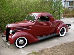
The next box in my draft for my digipak is the first inside image. This is of my artist looking up and touching a forty ford. This is because my actual music video is going to be set in an older era, i am going to film my music video and then put a sepia contrast edit over the top of the footage to make it look older. I have access to old cars also, which means i can use it during the car crash. It is also very visually pleasing and captures beautifully on camera, here is a copy of the car i will be using, it isnt the exact car but it gives you an idea of what it will look like in the image:
The next box will be another image inside my digipak. This will be shot on location also, showing my artist in the meadow. I might change the angle/choice of shot for this particular photo. I felt a diagonal photo would be effective though, contrasting and interesting to look at. However, I might also experiement with an extreme close up, as it will be a huge contrast to the opposite photo of my artist standing next to the car.
Subscribe to:
Posts (Atom)