
 This is because i feel it will help to keep up the vintage, older era style i wish to portray in my music video. I chose to have the fram filled with a collage of photos as i feel it will allow me to show all my abilites and skills with photography and artistic design. I was thinking about how i might begin to make the collage. I could do it on the computer, scatter the images across a document and use that. However, i might print out individual images, place them on a flat surface, possibly covered in coloured paper and scatter the images across the background. I thought of this idea as i used it during AS when creating a collage for the back of my magazine cover. I could do the same thing i did with that, upload the photo of the scattered photos to the computer and fade it, so it's not so harsh. This is what my collage in A2 looked like on before being edited and put on my actual magazine:
Within the writing I am going to include a list of tracks. I will then also have a “special thanks” section. I feel this is necessary, as the music artist I am focusing on is very young, of the age 16. Therefore she would be hugely grateful to everyone who has supported her and made the up rise of her career possible.
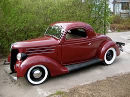
The next box in my draft for my digipak is the first inside image. This is of my artist looking up and touching a forty ford. This is because my actual music video is going to be set in an older era, i am going to film my music video and then put a sepia contrast edit over the top of the footage to make it look older. I have access to old cars also, which means i can use it during the car crash. It is also very visually pleasing and captures beautifully on camera, here is a copy of the car i will be using, it isnt the exact car but it gives you an idea of what it will look like in the image:
The next box will be another image inside my digipak. This will be shot on location also, showing my artist in the meadow. I might change the angle/choice of shot for this particular photo. I felt a diagonal photo would be effective though, contrasting and interesting to look at. However, I might also experiement with an extreme close up, as it will be a huge contrast to the opposite photo of my artist standing next to the car.
No comments:
Post a Comment