


This is the second draft of my digipak. Here you are able to see the vast changes i have made from the first attempt i made at this product.
FRONT COVER:
I changed the photo to one i took on set location, as i felt it accompanied the concept of a 'dream world' - as this is my albums name. I changed the contrast of the photo, in order to make the colours more vibrant and the actual location seem more surreal and beautiful. The lighting on the sky looks as though it is a rainbow. The titles are italic and bold, but feminine, highlighting my theme of nature and beauty - which is typical within Indie Folk music bands. The animation of the birds adds the the photo, making it look more professional.
BACK COVER:
I changed the way my text was positioned, making it at the bottom on the grass, on the same page that used to be my "Thank You" page. I decided to get rid of this page as it made the digipak look less realistic and more childlike. I changed the colouring of the text too in order to accompany the colours from the front cover. I gathered these by using colours from my main artists dress, so that all colours look professional and well suited to the theme of my digipak.You can also see that I have changed my production logo, making it white, and having the word "records" written in circles. This makes it fit well with the other light colour production details at the bottom of the screen and also looks like records.
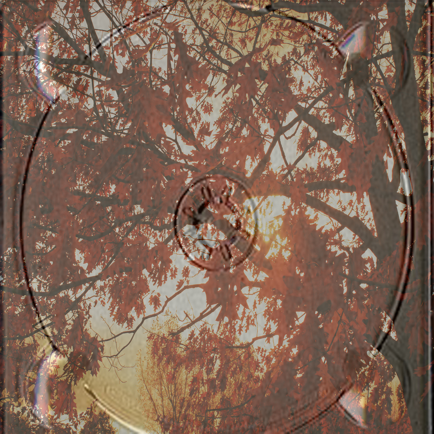
DISC HOLDERS:
For these i decided i didn't want to break the theme of nature, and also didn't want a plain disc place, as it would look boring and unprofessional. Therefore I decided I would use photo's I took when filming, of trees, the orange leaves glow through very nicely, as well as fitting in with my vintage theme.
OTHER PHOTOS:
The two other pictures are of my music artist. This is because they look very much in theme with the rest of my disc and are also high quality photo's i took myself. These were taken on set location. The background and colouring of both photos fit very well with the rest of my digipak. They also show the music artist, which buyers of the product would like, as they will be fans of Birdy, therefore will want to have photos and momentum's of her.
No comments:
Post a Comment